
Is Your Website Losing You Customers? 7 Warning Signs (and Fixes)
Your website might be quietly driving customers away. Here are 7 warning signs - from slow load times to weak calls-to-action - and exactly how to fix each one.
 Ali RehmanFull Stack Web Developer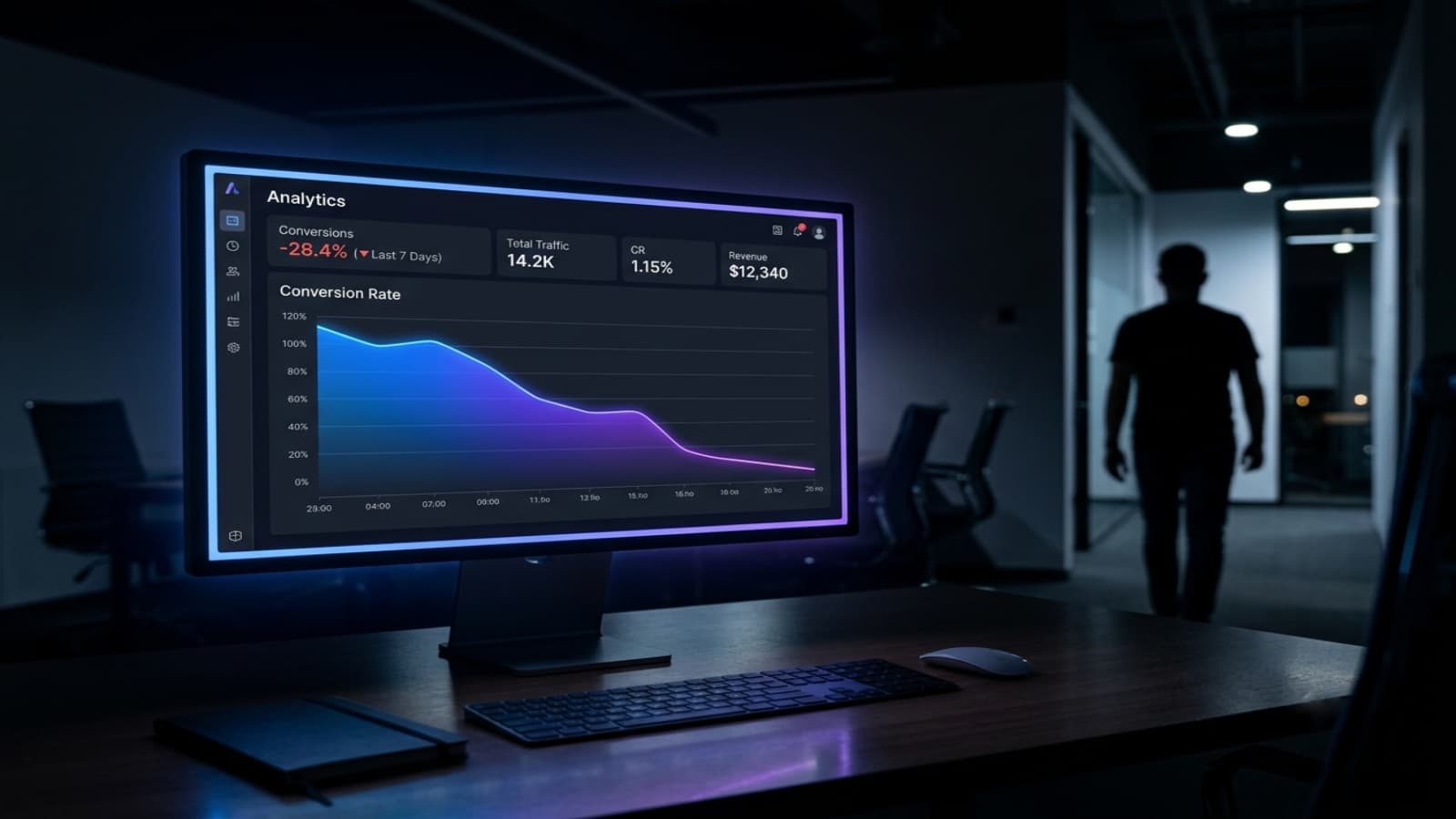
On this page 12 sections
You’re getting visitors - but far too few of them turn into customers. It’s one of the most frustrating problems in business, and the culprit is often hiding in plain sight: the website itself. A site can look perfectly fine to you while quietly leaking sales every single day, because the things that drive visitors away are rarely obvious from the outside.
The good news is that these problems are common, well understood, and fixable. Below are the seven issues I see most often when I audit underperforming sites, why each one costs you money, and exactly how to fix it. If you’re weighing up whether to refresh or rebuild, it also helps to understand what a website actually costs and how to hire the right developer to do it.
How to tell if your website is the problem
Before the list, a quick gut check. If your traffic is steady but enquiries are low, if people click through from Google and immediately leave, or if visitors browse but never contact you, the site is very likely the bottleneck - not your marketing. Analytics tools like a high “bounce rate” or a low average time on page are strong clues. Keep those symptoms in mind as you read, because each of the seven signs below maps directly to a leak you can plug.
1. It loads too slowly
Speed is the silent killer of conversions. Studies consistently show that most visitors abandon a page that takes more than about three seconds to load, and every additional second measurably reduces the number of people who stick around to buy or enquire. Slow sites are punished twice: once by impatient users, and again by Google, which uses page speed and Core Web Vitals as ranking factors - so a sluggish site ranks lower and converts worse. The fix: compress and correctly size images, use modern hosting and a fast framework like Next.js, remove unnecessary scripts and third-party bloat, and lean on caching. I go deep on this in my Next.js performance optimization guide, and speed is something I build in from day one on every project I take on.
2. It's not mobile-friendly
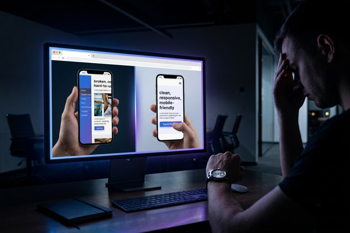
More than half of all web traffic now comes from phones, and for many local businesses it’s far higher. If your site is hard to read, tap or navigate on a small screen, you’re losing a huge share of your customers the instant they arrive - and they rarely give you a second chance. Google also indexes the mobile version of your site first, so a poor mobile experience quietly drags down your rankings too. The fix: a genuinely responsive design that looks and works beautifully on every screen size, with tap-friendly buttons, readable text without zooming, and no horizontal scrolling. Test it on a real phone, not just a shrunk-down browser window.
3. The design looks outdated
First impressions form in milliseconds, and an old-fashioned design sends an unintended message: “this business might be out of date too.” Cluttered layouts, tiny text, stock-photo overload and early-2010s styling all erode trust before a visitor has read a single word. In competitive markets, a dated site hands business straight to rivals who simply look more credible. The fix: a clean, modern, professional design with generous spacing, clear typography and a consistent brand identity that builds instant trust. You don’t need flashy gimmicks - you need to look like the confident, current business you are.
4. Visitors can't find what they need
Confusing navigation is a conversion killer. When menus are cluttered, labels are vague, or the path to the thing a visitor wants is buried three clicks deep, people simply give up - usually in favour of a competitor who made it easy. Every extra moment of confusion is a chance to lose the sale. The fix: simplify. Use clear, descriptive menu labels, keep the important pages one click away, add a search box on larger sites, and design an obvious path that guides visitors toward what matters - whether that’s booking, buying or getting in touch. A good rule is the “three-click test”: any important page should be reachable in three clicks or fewer. Good structure isn’t just user-friendly; it also helps Google understand and rank your site.
5. There's no clear call-to-action

Even a beautiful, fast, well-organised site fails if it never tells the visitor what to do next. If it’s not immediately obvious how to book, buy, or get in touch, most people will do the easiest thing of all - nothing. Pages crowded with competing links and no clear priority are just as bad as pages with no direction at all. The fix: give every key page one prominent, specific call-to-action - “Get a free quote,” “Book a consultation,” “Start your order” - and make the button impossible to miss. Guide visitors, don’t make them guess.
6. It's hard to contact you
Nothing wastes a hard-won visitor faster than making them hunt for a way to reach you. Contact details buried in a footer, a broken form, or a single stiff enquiry box with no alternatives all cost you leads - especially from people who were ready to act right now. Different customers prefer different channels, and forcing everyone through one is a mistake. The fix: make contact effortless. Offer an easy, working contact form, a visible email address, and quick options like WhatsApp so customers can reach you the way they prefer. If someone wants to hire you, removing friction at that exact moment is one of the highest-return changes you can make - it’s exactly why I keep my own contact page simple and offer messaging without any need for a call.
7. It's not secure (no HTTPS)

Modern browsers now actively warn visitors when a site doesn’t use HTTPS, displaying a “Not Secure” label right next to your address. That’s an instant trust-killer - and it’s fatal if you ask for any personal details or payments. Security also affects rankings, and a site handling logins or checkout without proper protection is a genuine liability. The fix: a valid SSL certificate (so you get the padlock and HTTPS), plus modern security headers to protect against common attacks. If your site collects data or has user accounts, it’s worth doing this properly - the same rigour I describe in my guide to secure authentication.
A few more warning signs worth checking
The seven above are the big ones, but a handful of smaller issues quietly chip away at conversions too. If you recognise several of these, they add up fast:
- Thin or unclear content - visitors can’t quickly tell what you do, who it’s for, or why they should choose you.
- No social proof - no reviews, testimonials, logos or case studies to reassure a hesitant buyer.
- Broken links or forms - a contact form that silently fails is a lead lost forever.
- No analytics - if you’re not measuring visitors and where they drop off, you’re flying blind.
- Weak or missing SEO - no clear titles, descriptions or structure, so Google never sends you traffic in the first place.
Each of these is quick to fix on its own, but together they make the difference between a site that merely exists and one that actively wins business. Trust signals in particular - genuine testimonials and real examples of your work - can lift conversions dramatically, which is why I put my own portfolio of live projects front and centre.
What these problems are really costing you
It’s easy to shrug off a slow or dated site because the cost is invisible - but that’s exactly what makes it dangerous. Imagine 1,000 visitors a month and a modest 2% conversion rate: that’s 20 enquiries. Fix the leaks and lift that to 4% - entirely realistic when you address speed, mobile and calls-to-action - and you’ve doubled your leads from the same traffic, for free. Now multiply that by the lifetime value of each customer, month after month. The few hundred dollars a proper fix costs is tiny next to the business a broken site quietly turns away every day it stays broken. Doing nothing is rarely the cheap option - it’s just the option whose cost you never see on an invoice.
The good news: all of this is fixable
Here’s the encouraging part: every single one of these problems can be solved - usually faster and more affordably than you’d expect. You often don’t need to start from scratch. A focused refresh that fixes speed, mobile, structure and calls-to-action can dramatically increase how many of your existing visitors turn into customers, without the cost of a full rebuild. The best part is that these improvements compound: a faster, clearer, more trustworthy site ranks higher, attracts more visitors, and converts more of them - a virtuous cycle instead of a slow leak.
If you want to know what fixing these issues typically involves - in time and budget - my guide on what a website costs in 2026 lays it out honestly, and how to hire the right web developer helps you choose someone who’ll do it properly.
Frequently asked questions
Why is my website getting traffic but no sales?
Almost always it’s one (or several) of the seven issues above - most commonly slow speed, a weak mobile experience, or the absence of a clear call-to-action. Traffic gets people to the door; the site’s job is to convert them, and that’s where these leaks do their damage.
Do I need a full redesign or just a refresh?
Often a targeted refresh is enough - fixing performance, mobile and structure while keeping what works. A full redesign only makes sense if the site is fundamentally outdated or built on technology that’s holding you back.
How quickly will I see results after fixing these?
Conversion improvements (from better speed, CTAs and mobile) can show up almost immediately. SEO gains build over a few weeks to months as Google re-crawls and re-ranks your improved pages.
Is it my website or my marketing that's the problem?
A simple test: if people are arriving on your site (you have traffic) but not enquiring, the website is almost certainly the bottleneck. If barely anyone is arriving at all, that’s a marketing and SEO problem first - though a slow, poorly structured site makes SEO harder too, so the two are often linked.
Want a fast, modern, conversion-focused site that actually earns its keep? See my web development services, browse some recent work, or message me to talk about your project - no calls required. New to all this? Start with how much a website costs and how to hire the right developer.
Written by
Ali Rehman - Full Stack Developer
I build fast, scalable web applications with React, Next.js, Node.js & TypeScript. Have a project in mind? Send me a message and get a written plan with a fixed quote - start here.
More articles by Ali Rehman →